8 Of The World's Most Colourful Buildings And The Stories Behind Them | SEE Pics
From a centuries-old temple in Tamil Nadu to a colourful waste plant in Osaka, 8 buildings show how architects have used colour to transform architecture. Featured in Chromatic Architecture, the structures use vivid pigments, ceramics and mosaics.
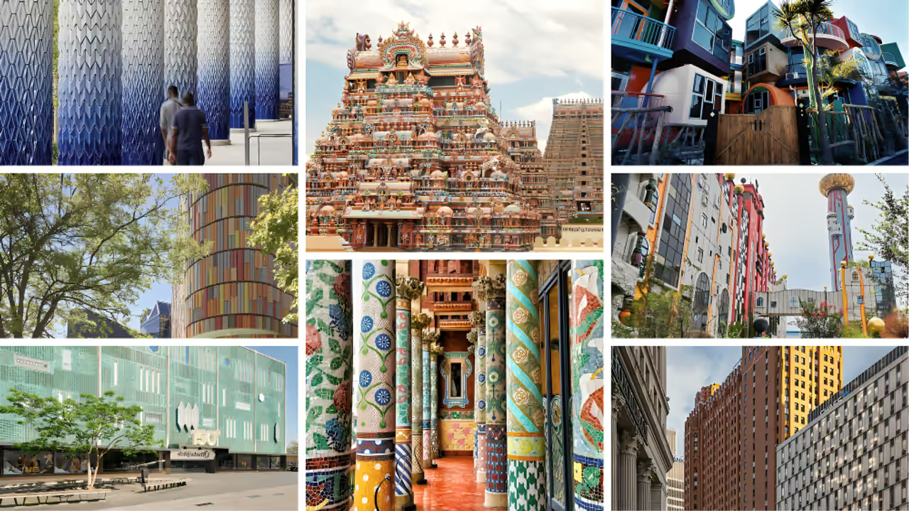
Eight colourful buildings that show how architecture can transform with colour
Colour has been part of architecture for thousands of years. From painted temples and ancient mosaics to stained-glass windows and bold modern buildings, architects have repeatedly used colour to make spaces more memorable, dramatic and joyful.
A new book, Chromatic Architecture - the Craft of Colour in Design, as mentioned in a report by BBC explores this relationship between buildings and colour. Designer Adam Nathaniel Furman and author Kate Mazade argue that colour can do much more than decorate a structure. Used well, it can change how people experience a building and even give an ordinary place a strong identity.
The book brings together striking examples from around the world. They range from a huge temple complex in Tamil Nadu to a waste incinerator in Osaka and a public library in Spain.
Here are eight buildings where colour is not an afterthought but a central part of the architecture.


Sri Ranganathaswamy Temple, Tamil Nadu, India
Tamil Nadu has a long tradition of using vivid colours in religious architecture. One of its best-known examples is the Sri Ranganathaswamy Temple in Srirangam.
The Ranganathaswamy Temple in Srirangam in Tamil Nadu is dedicated to Lord Ranganathar, a form of Vishnu. Built in Tamil architectural style, it is the world’s largest functioning religious complex. The temple has been expanded over centuries and features 21 gateways. It received a UNESCO Asia-Pacific Award of Merit in 2017.
Construction of the temple complex began in the 1st Century AD and continued under several dynasties for centuries. Later additions continued into modern times. Today, the complex covers more than 150 acres and is among the world's largest functioning Hindu temple complexes.
Its 21 towering gateways, known as gopurams, are covered with brightly painted sculptures. Gods, mythical figures, animals and other decorative forms fill the gateways, creating a striking wall of colour.
For Furman, the use of pigment is closely linked to the spiritual experience of the place. The intense colours help separate the temple from the ordinary world and create an atmosphere of wonder for visitors and worshippers.
Palau de la Música Catalana, Barcelona, Spain
Barcelona's Palau de la Música Catalana opened in 1908 and quickly became a symbol of Catalonia's cultural confidence.
Designed by architect Lluís Domènech i Montaner, the concert hall combines elements of Art Nouveau, Gothic Revival and Romanesque architecture, along with Moorish and Valencian influences.
Colour appears almost everywhere. Decorative tiles, stained glass, mosaics, columns, sculptures and intricate stonework work together to create an interior that feels closer to a fairytale than a conventional concert hall.
Furman describes the building as a place where every architectural detail contributes to the overall effect. Rather than being applied simply as decoration, colour becomes part of the building's identity.
Guardian Building, Detroit, US
The Guardian Building in Detroit was completed in 1929 and is one of the city's best-known Art Deco landmarks. Designed by Wirt C. Rowland, it became known locally as the "Cathedral of Finance".
The building's exterior is covered with nearly two million orange-toned bricks and terracotta tiles. Inside, the main lobby is even more dramatic, with a three-storey vaulted ceiling and a rich arrangement of tiles in strong primary colours.
The colourful interiors also reflect the craftsmanship of the Great Lakes region during the early 20th Century.
At a time when Detroit was becoming a major centre of American industry and commerce, the building made a confident statement. Its colours and decoration still communicate that sense of ambition today.
De Bijenkorf department store, Eindhoven, Netherlands
Designed by Italian architect and designer Gio Ponti, De Bijenkorf department store in Eindhoven opened in 1969.
The large, windowless building could easily have become another dull concrete structure. Ponti took a very different approach.
He covered the exterior with a striking geometric pattern of green tiles. Reports suggest that the design was inspired by the patchwork appearance of Dutch farmland when seen from above.
The result was a building that stood out strongly from its surroundings.
Furman sees the project as an example of how colour can rescue an otherwise plain modernist structure. Instead of hiding its large concrete form, Ponti turned the building into something closer to a giant piece of public art.
Reversible Destiny Lofts, Tokyo, Japan
The Reversible Destiny Lofts in Tokyo were completed in 2005 by artist-architect Shusaku Arakawa and poet Madeline Gins.
The unusual residential complex was created as a tribute to American disability rights advocate and writer Helen Keller. Its nine apartments contain brightly coloured cylinders, spheres, cuboids and uneven surfaces.
The unusual design was intentional. Arakawa and Gins believed that an environment that challenged the body and senses could encourage people to remain active.
Colour plays an important part in that idea. Strong shades cover different surfaces, while uneven floors and unusual room shapes prevent the apartments from feeling like conventional homes.
The result is deliberately intense. Rather than allowing residents to disappear into a predictable domestic routine, the designers wanted the building to keep them alert and engaged with their surroundings.
Maishima Waste Incinerator Plant, Osaka, Japan
Perhaps the most surprising building on the list is the Maishima Waste Incineration Plant in Osaka.
Designed by Austrian artist and architect Friedensreich Hundertwasser, the plant looks more like a colourful fantasy castle than an industrial facility.
Hundertwasser strongly opposed the rigid lines and uniform appearance associated with much of modern architecture. He believed buildings should feel more like living organisms.
That philosophy is clearly visible at Maishima. Yellow stripes appear to drip down parts of the building, while red stripes decorate its tall cylindrical tower. Rounded structures, colourful walls and unusual shapes make the plant look remarkably playful.
The building's appearance also challenges the usual image of waste facilities as purely functional spaces. Its bright colours turn an essential but often overlooked public service into a visual landmark.
Leganés Central Library, Leganés, Spain
Completed in 2019, the Leganés Central Library was designed by BN Asociados Arquitectos.
The building uses colour to reflect what is inside it. Large pastel ceramic panels cover its rounded exterior, creating a soft and unusual appearance.
The architects were also responding to the character of the surrounding neighbourhood, which lacked major cultural landmarks. The library was designed to become a visible public destination.
As sunlight moves across the curved ceramic surface, the colours and textures change during the day. The pale tones can resemble sheets of paper, creating a visual connection between the building and the books housed within it.
Here, colour helps the library communicate its purpose before a visitor even enters.
Croydon Colonnade, London, UK
The Croydon Colonnade in East Croydon was completed in 2003. Designed by Adam Nathaniel Furman, it creates a colourful pedestrian space near the railway station.
The 50-metre structure consists of 16 large columns and two walls covered with thousands of handmade porcelain tiles.
The tiles are coated in thick, translucent glaze. The colour begins with a deep blue near the bottom and gradually changes to creamy white towards the top.
The effect is designed to surround pedestrians with colour rather than simply present it as a distant feature.
Furman drew inspiration from the long history of blue-and-white architectural ceramics used across different civilisations and regions, including ancient Egypt, Portugal, Turkey, Iran and Babylon.
The result gives an otherwise ordinary transport setting a more memorable character.
Why colour still matters in architecture
These eight buildings show that colour can serve very different purposes.
It can express religious devotion, as seen at the Sri Ranganathaswamy Temple. It can represent cultural identity, as at the Palau de la Música Catalana. It can celebrate commercial success, as in Detroit's Guardian Building.
In other cases, colour can make an industrial building more welcoming, give a new neighbourhood a landmark or turn a transport route into an experience.
That is why colour remains such a powerful architectural tool. It can change how people feel about a building before they have even understood its design.
For Furman and Mazade, that is precisely the point. Architecture does not have to be grey, restrained or purely functional. Colour can give buildings personality, create memories and connect them with the communities around them.
From an ancient temple in southern India to a futuristic apartment complex in Tokyo, these examples make one thing clear: when architects use colour boldly, a building can become much more than a structure. It can become an experience.
Check the Breaking News Today and Latest News from across India and around the world. Stay updated with the latest World News and global developments from politics to economy and current affairs. Get in-depth coverage of China News, Europe News, Pakistan News, and South Asia News, along with top headlines from the UK and US. Follow expert analysis, international trends, and breaking updates from around the globe. Download the Asianet News Official App from the Android Play Store and iPhone App Store for accurate and timely news updates anytime, anywhere.