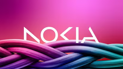
Why did Nokia change its iconic logo after 60 years?

Synopsis
Nokia announced plans to change its brand identity for the first time in nearly 60 years, complete with a new logo, as the telecom equipment maker focuses on aggressive growth. The iconic blue color of the old logo has been dropped for a range of colours depending on the use.
As part of its drive for bold development in the telecom equipment sector, Nokia revealed its intentions to update its brand identification for the first time in nearly 60 years, including a new logo. The word NOKIA is created using five different forms in the updated logo. The new logo includes a variety of hues based on its intended use, in contrast to the previous logo's distinctive blue colour.
According to Chief Executive Pekka Lundmark, "There was the association to smartphones and today we are a corporate technology firm." He further said, “In most people’s minds, we are still a successful mobile phone brand, but this is not what Nokia is about.We want to launch a new brand that is focusing very much on the networks and industrial digitalization, which is a completely different thing from the legacy mobile phones.”
Also Read | Who is Ajay Banga, US President Biden's pick for World Bank president?
This statement was made in anticipation ahead of a business update that the company plans to provide on the eve of the annual Mobile World Congress (MWC), which will take place in Barcelona from Monday until March 2.
Lundmark created a three-stage strategy comprising of resetting, accelerating, and expanding after taking over as CEO of the faltering Finnish business in 2020. Now that the reset period is over, Lundmark is concentrating on supplying equipment to other companies, even though it still wants to grow its service provider business.
Nokia will be in direct rivalry with major tech companies like Microsoft and Amazon as a result of its expansion into data centres and industrial automation.
Also Read | Nokia G22, Nokia C32 and Nokia C22 launched; Know features, price, other details
(Photo:@fabianarbor | Twitter)
Stay updated with all the latest Business News, including market trends, Share Market News, stock updates, taxation, IPOs, banking, finance, real estate, savings, and investments. Track daily Gold Price changes, updates on DA Hike, and the latest developments on the 8th Pay Commission. Get in-depth analysis, expert opinions, and real-time updates to make informed financial decisions. Download the Asianet News Official App from the Android Play Store and iPhone App Store to stay ahead in business.