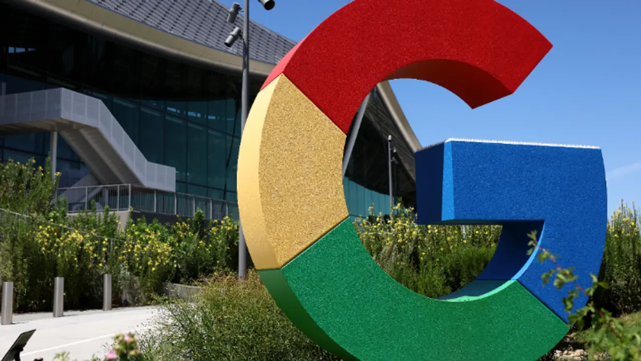
Google has subtly redesigned its iconic 'G' logo, shifting from the segmented color scheme to a flowing, multicolored gradient. This new design aligns with the branding of Google's AI products like Gemini.
For the first significant graphic upgrade in almost a decade, Google has introduced a revamped version of its famous "G" logo in a subtle but significant change. The new design abandons the conventional segmented color scheme in favor of a flowing, multicolored gradient that seamlessly combines Google's iconic red, yellow, green, and blue colors into a swirl.

This elegant style is reminiscent of the new branding for Google's AI products, such as Gemini and the AI Mode in Search. The company's larger effort to create a cohesive and contemporary visual identity for all of its services is reflected in the gradient design.
After the release of version 16.18 (beta) of the Google Search app for Android, the revised "G" has already started to show up on the Google app for iOS devices and on Pixel phones. On other Android devices and online platforms, the traditional segmented "G" is still there, suggesting a staggered deployment as opposed to an abrupt worldwide change.
As of right now, Google has not formally announced the change or its broader rollout across all platforms. However, in order to preserve uniformity throughout the brand's visual ecology, the makeover raises the possibility that other icons, including those for Chrome, Maps, and other Google services, may soon get a similar treatment. The gradient design may, however, eventually be extended to other services given Google's concentration on AI across all of its businesses.
As the company integrates more AI features, the new gradient design reflects its evolving brand identity, particularly with the launch of Google Gemini, its generative AI assistant. Gemini's logo already incorporates a blue-to-purple gradient, further signalling a shift toward dynamic, gradient-based aesthetics in Google’s visual identity.
This is the first significant alteration to Google's logo since the tech giant unveiled a more contemporary six-letter wordmark and a flatter, sans-serif design in September 2015. The now-familiar freestanding "G" made consisting of four different color segments was also added in that version.
This upgrade, which follows a trend in Google's commitment to visual progression, comes almost ten years after the last logo makeover, much like the redesign of the Google Play logo on its tenth anniversary.
Currently, the new ‘G’ icon is visible on iOS and Pixel devices, while the older version remains in use on other platforms, including the web and non-Pixel Android devices. The new design is expected to roll out more widely across different devices and platforms in the coming weeks.


