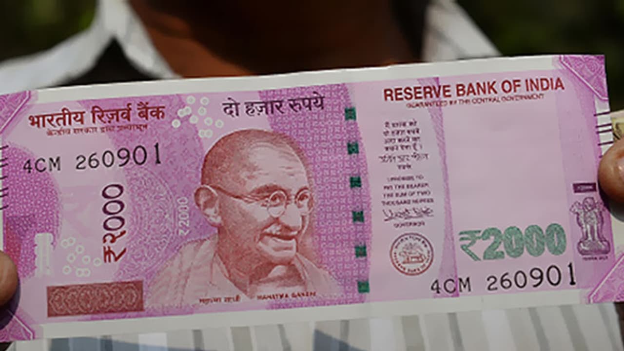
Earlier this month, Modi government banned ₹500 and ₹1000 notes. A new ₹2000 note has been issued by RBI. Design experts but have found issues with new ₹2000 note.
The new ₹2000 note is currently the highest denomination in circulation since Modi government decided to ban ₹500 and ₹1000 notes. Behind this massive rejig was the idea that the demonetisation will make all “black money” and counterfeit currency held in ₹500 and ₹1,000 notes useless. And in its place now the government has introduced the new ₹2000 note in lavender colour which according to design experts is flawed at several levels.

1. Too many elements
There seems to have been an attempt to somehow make use of every square centimetre of space, packing it with almost every motif possible from across India. Appeasement? Over design?
2. So many fonts, badly printed
Though this may be a security feature, the note features more than 12 different fonts, in different sizes, styles and thickness. It makes the note seem chaotic at a glance. Also, some of the alphabets in some words (Guaranteed, ₹2000) touch each other. Spacing error?
3. Pink
Yes, somewhere across the nation there may be those who enjoy that colour. However, for a note which will be our highest denomination, it feels odd for it to be blazing pink, an unsophisticated colour.
4. Too many styles
The new note includes ornamental designs, spirals and geometric blocks. Even the three pictures - Gandhiji, Manglayaan and the 'elephant' strip in the bottom - are in three different styles - etching, painting and block design. There is no synergy.
5. Completely unaligned
Again, a possible security feature but something that feels odd nevertheless. Of the 20 or so elements on the note, none of them follow any layout, pattern, grid or alignment. Each element seems to be randomly adjusted in some available space.
6. Changed logo
The Swachh Bharat logo has been amateurishly changed. It seems to have been squeezed to make it fit into some space and the font on the glasses has been changed.
7. So many elephants
On the reverse of the strip, a repeating pattern of 'Elephant, Lotus, Peacock' occurs. Firstly, the repetition of the motif makes this a very lazy design. Secondly, Lotus is National Flower, Peacock is National Bird, But the elephant is just a modern caricature for India. Our actual National Animal is the Tiger. Oversight?
