New BRICS Logo Launched as India Sets Agenda for Its 2026 Presidency | All You Need to Know
India has launched the official logo and website for its BRICS Presidency 2026 in New Delhi. EAM S Jaishankar said the logo reflects India's priorities of resilience, innovation, cooperation and sustainability as the country prepares to lead BRICS.
India on Tuesday formally launched the logo and official website for its BRICS Presidency 2026, marking the beginning of preparations for its upcoming chairmanship of the influential global grouping. The launch event was held in New Delhi and was attended by External Affairs Minister S Jaishankar, senior officials, and members of the diplomatic community.
The unveiling of the logo and website sets the tone for India’s leadership year and reflects how New Delhi plans to guide BRICS at a time of major global and economic change.
Design rooted in Indian culture and shared values
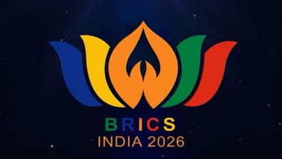
The newly launched BRICS 2026 logo strongly reflects India’s cultural identity while also highlighting the collective spirit of the group. The overall shape of the logo is inspired by the lotus, India’s national flower, which is often associated with growth, balance and resilience.
At the centre of the logo, the inner petals form two hands joined in a Namaste, a traditional Indian gesture of greeting, respect and welcome. This design element symbolises India’s approach to diplomacy, which places emphasis on dialogue, mutual respect and peaceful cooperation.
Stay updated with the Breaking News Today and Latest News from across India and around the world. Get real-time updates, in-depth analysis, and comprehensive coverage of India News, World News, Indian Defence News, Kerala News, and Karnataka News. From politics to current affairs, follow every major story as it unfolds. Get real-time updates from IMD on major cities weather forecasts, including Rain alerts, Cyclone warnings, and temperature trends. Download the Asianet News Official App from the Android Play Store and iPhone App Store for accurate and timely news updates anytime, anywhere.